For decades, the interior design world was dominated by the calm and neutral palette of white and gray. This minimalist backdrop allowed homeowners to personalize their spaces through furniture, textiles, and accessories, but over time, it became a default aesthetic that risked feeling repetitive and impersonal. In recent years, however, designers and architects are challenging this monotony, introducing warmth, texture, and bold color into interiors in ways that both captivate the eye and engage the brain.
Warm minimalism, characterized by earthy tones and light woods, has emerged as a favored alternative. Belgian designer Axel Vervoordt, with five decades of experience in art, antiques, and contemporary interiors, is one of the pioneers of this approach. His aesthetic—spanning terracottas, beiges, browns, and subtle blacks—has influenced mainstream brands like Zara Home, which collaborate with him to create bedding, furniture, and home accessories that embrace a Mediterranean-inspired palette. In Vervoordt’s vision, terracotta has become a hero color, adding warmth and depth to spaces that might otherwise feel cold or sterile.
Collections such as Zara Home + Vincent Van Duysen 03 (2024) showcase this philosophy. From raw wood and clay textures to brass details, the pieces remain grounded in natural materials, yet they exude sophistication and timelessness. This approach, rooted in the appreciation for local craftsmanship and organic materials, continues to resonate with homeowners seeking a more tactile, human-centric environment.
Yet while some designers continue to explore these subtle, meditative palettes, a new wave of creatives is embracing color in bold and deliberate ways. Emerging architects and designers reject monochrome minimalism, favoring intense hues and playful combinations that redefine how we experience interiors. Brands like Roca, Sancal, GAN, and even Ikea are leading the charge, proving that color is not just decorative—it actively shapes perception, mood, and emotion.
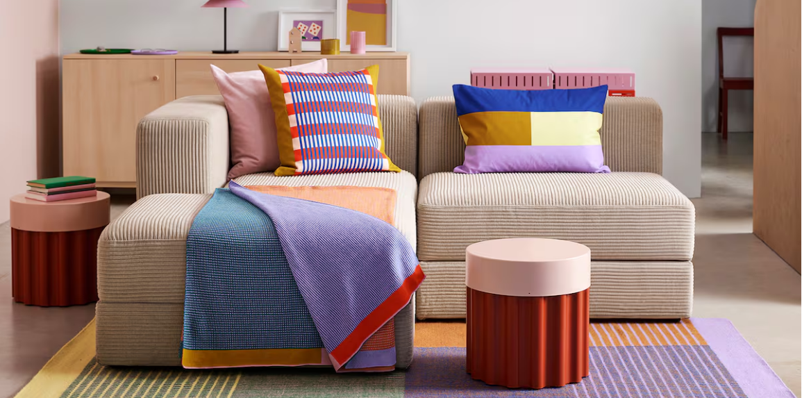
Ikea, for example, has partnered with the Spanish Society of Neuroscience (SENC) to study how the human brain reacts to different colors. Reviewing nearly fifty scientific studies, the team found that color perception involves a complex interaction of intensity, temperature, brightness, light, and contrast, processed simultaneously across multiple brain structures. Colors do not only inform visual perception but also activate the autonomic nervous system, influencing attention, emotion, and even hormonal responses. Red, orange, and pink can heighten alertness and excitement, while blue promotes relaxation, and green offers a balanced, calming effect.
This research directly informs Ikea’s Tesammans collection, created in collaboration with Dutch design studio Raw Color. The collection’s 18 pieces are designed to be mixed and matched, allowing homeowners to explore dynamic color interactions. According to designers Daniera ter Haar and Christoph Brach, “a color never exists in isolation. Its impact depends on what surrounds it. A red next to pink maintains its warmth, but next to blue, it feels more intense.” This principle underlines the transformative potential of color in everyday spaces.
In architecture and interior design, this philosophy is reflected in projects such as Paula Rosales’ Kitchen for Life, which breaks away from the traditional white kitchen, opting for vibrant, expressive hues. Similarly, Roca’s Nu faucet collection, designed by Inma Bermúdez Studio, introduces playful colors such as green, blue, and yellow alongside classic black, white, and chrome finishes. With minimalistic shapes, these faucets combine functionality with aesthetic appeal, earning accolades like the IF Design Award.
Sancal’s collaboration with Raw Color on the Line cushion series echoes this concept, fusing shape and color to create pieces that are both visually striking and versatile. Each cushion can be combined in multiple ways, enabling up to fifteen distinct arrangements and offering a playful, customizable addition to living spaces. The designers emphasize that thoughtful use of color can inject creativity and freshness, even into spaces defined by neutral or minimal backgrounds.
Interior studios are increasingly advocating for color as an essential design tool rather than a secondary consideration. Estudio Reciente’s Casa Rubens project in El Escorial, for example, uses color and texture strategically to enhance a fluid open-plan space. According to architect Carlos Tomás, minimalism alone is no longer sufficient. Homeowners now seek dynamic, personalized interiors where color, materials, and textures contribute to comfort, warmth, and visual interest.
Post-pandemic lifestyles have further influenced these trends. Before the pandemic, the “nesting” trend encouraged cozy, beige-toned refuges, away from technology and urban intensity. While those principles remain valid, remote work and home-centric living now demand spaces that stimulate the senses. Color, texture, and form have become essential tools for creating both restful and energizing environments, ensuring that homes are not only comfortable but also inspiring.
In summary, the era of the ubiquitous white-and-gray palette is giving way to a more vibrant, nuanced approach to home design. Designers are reintroducing color, texture, and warmth, creating spaces that are visually engaging, psychologically enriching, and deeply personal. Whether through terracotta accents, bold cushions, or playful kitchen accessories, the thoughtful use of color is transforming interiors into environments that delight the senses and reflect the individuality of those who inhabit them.